In Visioix Pro, the panel that opens from the bar shows a form. You can keep several forms, for example one for each product, service or department, each with its own questions, display rules and response history.
Where to find it: ARN Visioix → Forms.
The Forms screen
- Create a new form: enter a Form name and click Create Form. Visual Builder opens with an empty draft.
- Your forms: every form with its display location, Status, Version, number of Responses and Priority.
Actions for each form:
| Action | What it does |
|---|---|
| Open Builder | Edits the questions and structure in Visual Builder |
| Display Rules | Sets where the form appears, for whom, and its priority |
| Design Studio | Gives the form its own design (visible when per-form design is turned on) |
| Duplicate | Creates a copy named "… Copy" as a draft |
| Pause / Activate | Stops or starts showing the form |
| Archive | Takes the form out of use and keeps its history |
The first form, Original Visitor Intent Form, is created from your intent panel settings. See Choose where and when the intent bar appears for display rules and priority.
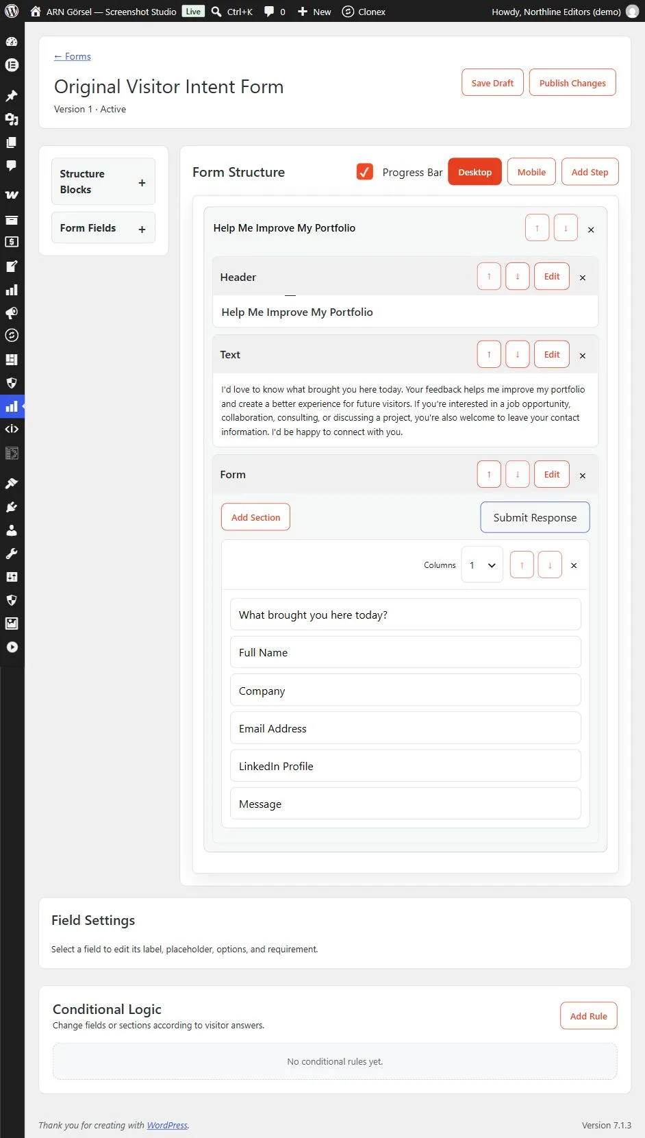
Build the form in Visual Builder
Visual Builder has three parts: the library on the left, the Form Structure in the middle and Field Settings on the right.
- Add content blocks. Open Structure Blocks and click or drag Header, Text, Highlighted Text, Notice, Divider, Spacer or Form into a step.
- Add a Form block. Fields can only be placed inside a Form block. A Form block contains sections; click Add Section for more, and choose 1 to 5 Columns for each section.
- Add fields. Open Form Fields and add Text, Textarea, Email, Phone, Number, Radio, Checkbox or Dropdown.
- Edit a field. Click it to open Field Settings: Label, Placeholder, Options (one per line for Radio, Checkbox and Dropdown), Column span and Required. Use Move Up, Move Down or Delete field as needed.
- Edit a block. Click Edit on a block. For a Form block, set the Submit label and the Success message visitors see after sending.
- Add steps. Click Add Step for a multi-step form and edit the step titles. Progress Bar shows visitors how far they are; it appears when the form has more than one step.
- Preview. Switch between Desktop and Mobile.
Click Save Draft while you work. Visitors keep seeing the last published version.
Publish safely
Publish Changes saves a new version, publishes it and makes the form Active at once. Before you publish a new form, set its display rules; a form without its own display rules can appear on every page. Visual Builder shows this warning under its header with an Open Display Rules link.
Every response is stored with the form version the visitor answered, so changing an active form does not change the meaning of earlier answers. If you plan a large change, use Duplicate and work on the copy.
How the intent is recorded
The intent of a response always comes from the choices the form offers: the intent question if the form has one, otherwise the first answered Radio or Dropdown question. A form without such an answer records "Form response". A free-text answer, such as a name or email address, is never used as the intent.
A response is refused if a Radio, Dropdown or Checkbox answer is not one of the options the form offers.
Add conditional logic
Under Conditional Logic, click Add Rule. A form needs at least one field first.
- Name the rule and keep Enabled selected.
- Build the Condition Group: choose ALL (AND) or ANY (OR), then add conditions with + Condition. Each condition compares a field with Equals, Does not equal, Contains, Is empty or Is not empty. Use + Group for nested groups (up to three levels).
- Add actions with + THEN Action (when the conditions match) and + ELSE Action (when they do not): Show, Hide, Make required, Make optional, Go to step, Success message or Redirect URL.
- Read the diagnostics line. It warns about missing fields or targets, conflicting actions, step branches that do not lead to a later step and empty values.
For example: if "How can we help?" equals "Request a call", show the Phone field and make it required.
Tip: Do not hide a required field without making it optional in the same rule. Test every branch on desktop and mobile with a real submission before you publish.
Give a form its own design
- Turn on Settings → Appearance → Use a separate Design Studio for each form and save.
- On Forms, click Design Studio next to the form.
- Adjust the Form Design while watching the Live Preview (Desktop and Mobile). The settings are listed in the table below.
- Click Publish Design. Reset returns to the default design.
| Group | Settings |
|---|---|
| Colors | Background, Text, Accent, Border, Button text, Button hover |
| Typography | Theme font, System Sans, Inter, Roboto, Open Sans, Lato, Montserrat, Poppins, Merriweather, Playfair Display, Serif or Monospace |
| Sizes (px) | Base size 12–24, Radius 0–40, Border width 0–6, Content width 320–1400, Spacing 4–48, Mobile width 280–782 |
| Layout and buttons | Alignment (Left, Center), Button style (Solid, Outline, Soft), Button size (Compact, Normal, Large), Shadow (None, Soft, Medium, Strong) |
| Scoped Custom CSS | Rules for the targets form, field, button, heading and text; external URLs, imports and global selectors are blocked |
| Responsive & Interaction | Desktop position (Bottom panel, Centered modal), Mobile position (Bottom sheet, Fullscreen), Desktop max height 40–95 vh, Mobile max height 50–100 vh, Mobile spacing 4–40, Animation (Slide, Fade, Scale), Animation duration 100–1000 ms |
| Reusable Design | Enter a design profile name and click Save Current Design; choose a saved profile and click Apply or Delete |
By default a form opens as a bottom panel on desktop and a bottom sheet on mobile with a slide animation; before Pro 2.0.1 these defaults cannot be changed on screen. Design profiles are shared by all forms and are stored when you click Publish Design.
Visitor pages load only the Google font that the form's design uses. Design changes do not change the questions or the response history.