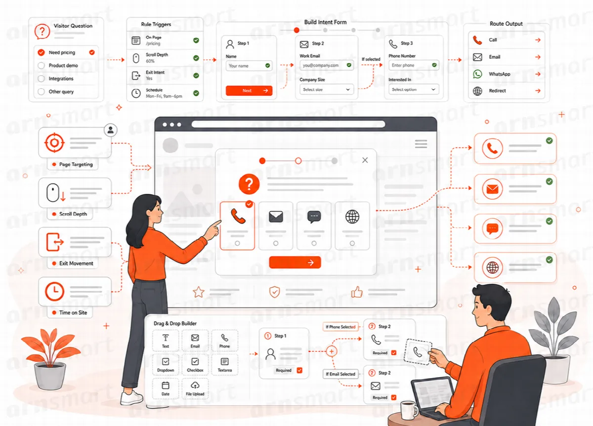
The intent bar is the heart of Visioix. A slim bar sits at the bottom of the page. When a visitor clicks it, a panel opens with your question. The answer is sent without reloading the page, and the visitor sees a thank-you message.
Where to find it: Settings in the Visioix menu: Visitor Intent → Settings (Free) or ARN Visioix → Settings (Pro). Click Save Settings after each change.
What visitors see
- The bar. Two short texts and an arrow. The × button dismisses the bar.
- The panel. Your title, introduction, question and fields, and the submit button.
- The success message. A thank-you title and message after a successful answer.
After a visitor submits or dismisses the bar, it stays hidden in that browser for a number of days.
General settings
On the General tab:
| Setting | Default | What it does |
|---|---|---|
| Enable the visitor intent bar | On | Turns the bar on or off for the whole site |
| Hide after successful submission (days) | 30 | How long the bar stays hidden after a visitor answered; 0 does not hide it |
| Hide after dismissing the bottom bar (days) | 30 | How long the bar stays hidden after a visitor closed it; 0 does not hide it |
Write the content
On the Content tab:
- Sticky Bar: Primary text and Action text.
- Success Message: Success title and Success message.
- Expanded Panel: Panel title, Introduction, Optional note, Intent question, Intent options — one per line, Contact question, Yes option, No option and Submit button.
Write choices that are specific enough to tell visitors apart, such as "Pricing question" and "Support for an existing order", and keep an "Other" choice. A visitor who chooses the Yes option sees the contact fields; the No option sends the answer without contact details.
Note (Pro): In Visioix Pro, the panel shows a form instead. The Expanded Panel and Contact Fields settings are used once, to create the first form, Original Visitor Intent Form. After that, edit questions and fields in Forms; the bar text and the success title still come from the Content tab. See Build forms with Visual Builder.
Choose the contact fields
On the Contact Fields tab, each field can be turned on or off and has its own label, placeholder and required state:
| Field | Default |
|---|---|
| Full Name | On, optional |
| Company | On, optional |
| On, required (Visioix Pro: on, optional) | |
| On, optional | |
| Message | On, optional |
Ask only for the details you need for a reply. Required fields apply only to visitors who chose to leave their contact details.
Change the look
On the Appearance tab:
| Setting | Default | Range or options |
|---|---|---|
| Bar background, Text color, Accent color, Panel background | White bar and panel, dark text, gold accent | Any color |
| Minimum bar height (px) | 52 | 42–100 |
| Panel content width (px) | 1100 | 600–1600 |
| Field and button radius (px) | 8 | 0–30 |
| Animation speed | Normal | Fast, Normal, Slow |
| Shadow strength | Medium | None, Soft, Medium, Strong |
In Visioix Pro, Use a separate Design Studio for each form lets individual forms have their own design. Leave it off to use these site-wide settings for every form.
How the answer is recorded
- The selected choice is saved as the response's intent. A submission is refused if the choice is not one of the options you configured.
- Contact details are saved only when the visitor enters them. A response without contact details is recorded as Anonymous; one with contact details as Contact lead.
- Responses appear under Visitor Responses. See Manage responses, email notifications and stored data.