Vendix Pro has nine full-screen hero widgets: ARN Hero — Story, Panels, Split, Typography, Sidebar, Fashion, Centered, Parallax and Editorial. Each design is its own Elementor widget with its own panel, views and styles. All of them run on one shared engine, so switching designs changes the layout, not the way the slider behaves.
Where to find them: in the Elementor editor, in the ARN Smart Widgets category. The ARN Hero designs are part of Vendix Pro.
Choose a design
| Design | Suits | Views |
|---|---|---|
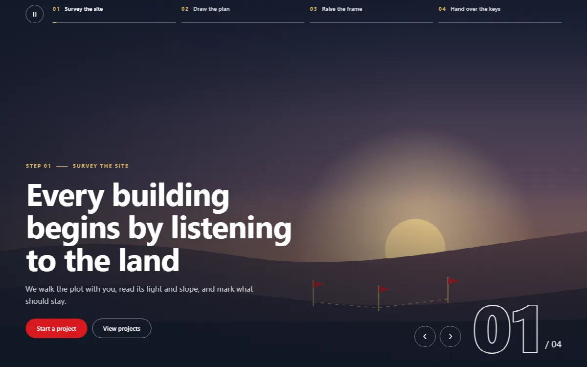
| Story | Processes told step by step | 4: step tabs along the bottom, steps in a side column, a numbered strip with a large counter, a light panel beside the media |
| Panels | Three to six offers side by side | 4: slanted, straight, colour panels or stacked rows; an accordion on phones |
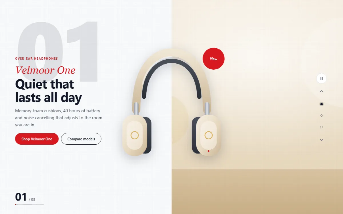
| Split | Product launches with a cut-out product image | 4: text beside the product, two-tone with the product on the seam, product in front of an arch, a dark showcase with a large number |
| Typography | One large word per slide | 4: one word across the screen, stacked lines, a moving band, the image inside the letters |
| Sidebar | Services with key figures | 3: solid colour bar, floating glass bar, a wide panel with the figures |
| Fashion | Collections and lookbooks | 3: full image under a top strip, image in a light frame, an arch image beside the text |
| Centered | Hospitality and brand introductions | 3: thin frame, light arch, a light page with an oval image |
| Parallax | Layered images that follow the pointer | 3: layers over the media, a framed poster, a light page with a media panel |
| Editorial | Magazines and featured stories | 3: magazine cover, a text column beside the media, framed media on a dark page |
A newly dropped hero arrives with a complete made-up story and drawings, for example an architecture firm for Story or a seaside hotel for Panels. Compare the views with the sample slides before you replace anything.
Add a hero to a page
- Drag the ARN Hero design you want onto the page.
- Choose a view in the widget's panel.
- Replace the sample slides. Each slide takes an image or a video background with a focal point and an overlay colour, plus a subtitle, title, text and up to three buttons, depending on the design.
- Set the transition, autoplay and navigation.
- Under page structure, choose the title HTML tag (by default the first title is the H1 and the others H2), give the hero an accessible name, and set a top offset if a transparent header sits over it.
- Check the page on desktop, on a phone, on a right-to-left page if you have one, and with reduced motion.
A slide can use a Media Library video or a video file URL, with the slide image as its poster. The video plays only while its slide is shown, the widget is on screen and the browser tab is visible.
What every design shares
- Keyboard. Arrow keys, Home and End move between slides once the widget has focus; left and right follow the reading direction.
- Swipe and drag. Touch swipe and mouse drag change slides and are mirrored on right-to-left sites. Both can be turned off.
- Autoplay you can stop. A play and pause button and a progress line appear while autoplay is on. Autoplay waits while the hero is hovered or focused, stays off for visitors who prefer reduced motion, and stays off in the editor until you press play.
- Lazy media. Images and videos of hidden slides load only when needed.
- Loading. The widget files load only on pages that use them. ARN Hero widgets also start inside Full Modal content.
Add corner links
Corner links add up to four links, such as About or Contact, to the corners of any ARN Hero widget. Each link opens a side panel or a modal inside the widget, with text or a saved Elementor template.
- Open the widget's Corner links section and turn the links on.
- Choose the corner: top start, top end, bottom start or bottom end. Start and End follow the reading direction.
- Choose a side panel (from the start or end edge) or a centered modal, and add the text or template.
Focus stays inside the open panel, Escape closes it and focus returns to the link. The content renders with the page; nothing is loaded later.
Company details in heroes
ARN Hero — Fashion uses the social profiles from ARN Vendix → Company Data in its top strip when the widget's own links are empty. ARN Hero — Parallax shows the Company Data social profiles in its corner interface. A network appears only when it has a profile address.
The ARN Hero Slider
The original ARN Hero Slider stays available beside the nine designs (it is also in Vendix Free). In Vendix Pro it has:
- Swipe and drag, on by default, mirrored on right-to-left sites. Text stays selectable and links still open on a plain click.
- Caption box styles: Boxed, Glass, Outline, Band or Card behind the slide content. Each slide can choose its own style; existing heroes keep None.
- First load animation: Fade up, Fade, Zoom or None for the first content once the slider appears on screen.
- Separate solid or outline styles and colours for the second and third buttons.
First Slide Title HTML Tag (Vendix 3.0.0 and later, Free and Pro) sets the heading tag of the first slide's title. It is H1 by default, as before. Choose H2 when the page has its own H1, so the page keeps a single H1; the other slides always use H2.
Existing Hero Slider widgets keep their look after an update. Only items that still used Elementor's grey placeholder image show a sample drawing instead.